
Feature Rotator
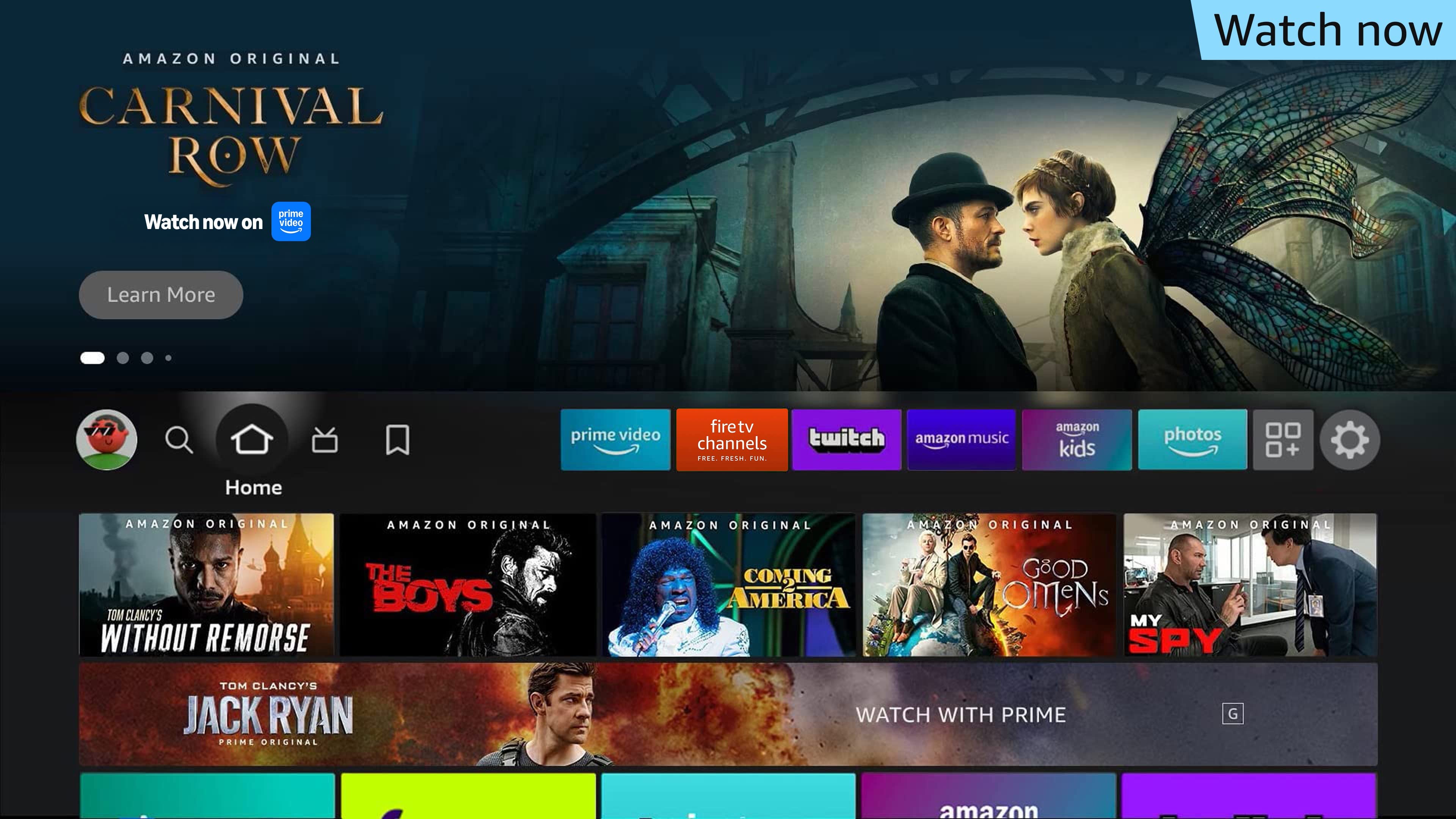
Feature Rotator is the most visible placement of the Fire TV user interface, engaging viewers the moment they power up their device and before they start streaming. It is located above the fold on the tabs for Home, Movies, TV, Apps, and Games. Each of these tabs contains a placement with slots for six pieces of content.
Feature Rotator comprises three assets: a background image, logo image, and video. Below are details about each asset, plus additional requirements.
Experience overview
Upon turning on their Fire TV devices, viewers begin their connected TV journey at Feature Rotator, where the focus is on the “Learn More” button. After a pause, the initial static imagery is replaced with full-screen autoplay video, with audio enabled. Viewers can use the left and right remote buttons to view other content items in the rotator or continue to watch the rest of the video.
When this video concludes, the initial static image is shown once more as an end slate before additional content items in the rotator are automatically shown.
When viewers click on the creatives, they will be taken to an ad destination where they can watch, buy, or download. See supported destinations.
Creative guidelines
Selection states
Unselected

Video Playback

Selected

Asset specifications
| Image component | Raw asset requirement* | Final file requirement |
| Background image | Dimension: 1920 x 720px or bigger Format: PSD (High-quality and layered) | Dimension: 1920 x 720px Max file weight: 450kb Format: JPG (baseline) |
| Logo image | Dimension: 640 x 260px or bigger Format: PSD (High-quality and layered), AI, EPS or SVG | Dimension: 640 x 260px Max file weight: 450kb Format: PNG |
| Video component | Dimensions | Max. File Weight | Format | Duration |
| Video** | 1920 x 1080px | 500mb | MP4, M4V, MOV, MPEG | 5-21s (up to 30s allowed for JP) |
* Raw assets are mandatory for paid ad campaigns. See our full Asset Checklist.
** Video is mandatory for all campaigns. For non-paid ads, trailer videos must be 6mb or less and in MP4 format.
Ad Content Restrictions
In order to make sure people of all ages have the best experience possible on their Fire TV, we work with our clients to run ads that are appropriate for all audiences. All Fire TV ad content must conform to Amazon’s Creative Acceptance guidelines and Fire TV Guidelines and Acceptance Policies. Amazon requires that advertisers review their content with these guidelines in mind before submitting.
Background images
Safe zone

Make sure the essential elements of the image are within the yellow safe area. Essential elements, like faces of key characters or products, that fall outside of the safe area may be covered by navigation UI or logo content. Legal text and rating labels will be placed in the green area.
Examples

Requirements
Dimensions: 1920 x 720px
Format: JPEG
Maximum file size: 450KB
✔ Do:
- Use cinematic imagery: Use imagery that is engaging and provides context to the ad.
- For entertainment ads: Use imagery that features the content that’s being promoted.
- For non-entertainment ads: Use imagery that communicates a story about the advertised brand, products, services, or promotional events to viewers. Make sure the subject of the background image matches the ad copy used in the logo image.
- Physical products: Imagery should show the advertised product, customer using the product, or be brand focused.
- Service products: Imagery should show customer using the service or the amenity that’s being advertised, or be brand focused.
- Brand focused: Brand-focused imagery should feature branded characters (e.g. brand mascots, ambassadors, or characters from brand’s commercials), show brand events (e.g. A trail day event from an outdoor product company), or include branded illustrations. Brand-focused imagery must communicate a clear brand story, or a brand’s products or services. Imagery that doesn’t provide context to the ad (e.g. generic patterns and graphics) is not allowed.
- Use high quality imagery: Background image should look clear on a high-definition television (HDTV); don't include upscaled images; image retouching is photorealistic; avoid defects in gradients, shadows, and perspective.
- Use balance: Use imagery that has a sufficient amount of space on the left side where the logo will overlay.
- Use imagery that makes full use of the space: Use a single image asset that extends all the way to the edge of a background image (full bleed). The following scenarios are also allowed when meeting our requirements:
- A single image that’s not big enough to fill the background image: The image asset should fill at least the right half (50%) of the background image with no gaps around the edges, while additional visual treatment can be added on the left side of the background image, with no gaps around the edges, to fill the empty space. For single titles, avoid a straight division (vertical line) between the image asset and the additional visual treatment.
- Multiple images need to show in one image: The combined image should have an edge-to-edge background that situates the image assets. The composition of a combined image should be balanced and prioritize the key subjects from the image assets. Avoid using plain background or visual treatment that has no association with the image assets.
- Only use text if necessary: Text is allowed in the background image asset with some guardrails:
- Keep primary messaging in logo image: Most important information should go in main logo lock up.
- Only include necessary information: Messaging should be clear.
- Text/Logos can be included to provide additional context and/or details (i.e accolades, event details, awards, etc).
- Keep text and logos in background legible: Must be within safe zone and should contrast well with additional background elements.
- Use a minimum font size of 18pt Arial Regular/Amazon Ember.
- Keep the number of lines in the background up to 2 lines.
- Keep logos and text in background naturally integrated with the composition.
- Use Depth: Varying depths of field in the image will provide a good backdrop.
- Place subject on the right: The main subject should be to the right side of the image.
- If an app is VSK-enabled: Include an Alexa Speech Bubble, ‘Alexa, play ___ on _____.” (See the guidelines for Voice Skills Kit-enabled apps.)
✔ Approved

This creative shows the advertised product.
✔ Approved

This creative shows a customer is using the advertised product.
✔ Approved

This creative shows a customer is using the advertised service.
✔ Approved

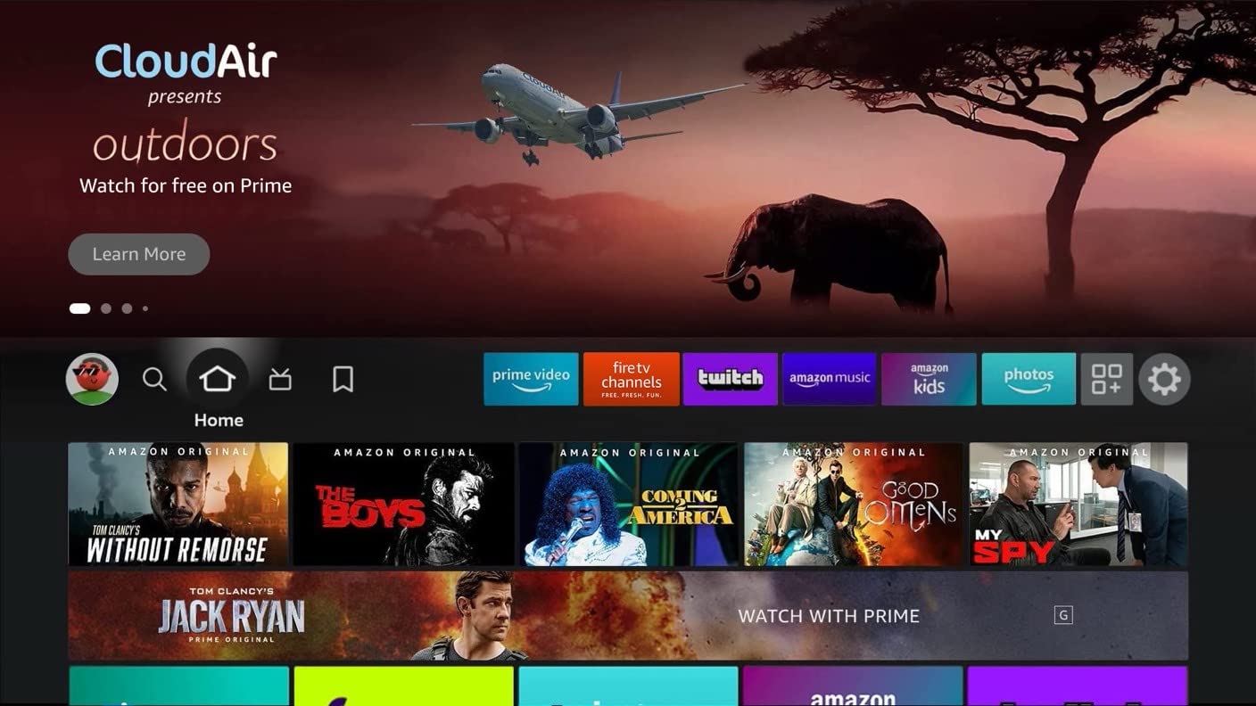
This creative shows the context (an airplane) of the advertised service.
✔ Approved

This creative features the brand’s mascots.
✔ Approved

This creative shows imagery that features an event sponsored by the brand.
✔ Approved

This creative shows branded illustrations that provides context for the brand’s products.
✘ Not approved

Why? The illustration in this creative looks generic and doesn’t help articulate a brand story.
✔ Approved

✘ Not approved

✔ Approved


✘ Not approved


✔ Approved


✘ Not approved


✔ Approved

✘ Not approved
This creative has text with clear
visual hierarchy and provides
contextual details.
This creative has text with
competing hierarchy and repeats
content from the logo.
✘ Do not:
- Crop heads and faces: Use the safe zones to verify placement of heads and faces.
- Place subject left: The main subject should not be on the left side because the UI may obscure it.
- Embed QR codes: QR codes should not be in the background image.
- Use busy imagery: Do not use imagery that has too many subjects or fine detail. Keep the top 64px free of key content and elements.
- Avoid graphics with white or light backgrounds: Predominantly white or light backgrounds are harsh on eyes and don’t provide enough contrast for UI elements. Brightness and/or saturation should be reduced if such backgrounds are used.
- Fill the entire background image with text: Text in background must not be the main or only object of the image.
- Use redundant messaging: Text in background image should not repeat from logo lock up.
- Saturate background with logos: Avoid logo repetition when not required.
- Overpower logo image: Text/Logos in background image should not compete with main logo lock up.
✔ Approved

✘ Not approved

Logo images
Examples

Logo elements
1: Full image asset size for the logo
2: Content title logo or brand logo
3: CTA text or brand headline (optional)
4: Content provider logo or secondary brand logo
Requirements
Dimensions: 640 x 260px
Format: 24-bit PNG (RGB color)
Maximum file size: 450KB
✔ Do:
- Only include necessary information in the logo lockup: Up to four lines of logo elements are allowed, as it helps maintain a clear visual hierarchy of the logo lockup.
- Keep visual hierarchy clear: The most important information should have the highest visual priority (e.g. a content logo stands out from other logo elements)
- Keep the logo lockup left aligned and vertically centered: At least one element in the logo image must be left aligned
- Keep the content visible: Logos should contrast with the background asset.
- Maintain a readable text scale: The CTA text should be at least 24pt Arial regular (or equivalent font). Consider removing extra lockup elements if they fall below 14pt.
- Use texture: Logos can contrast backgrounds with texture and effects.
- Use depth: The featured logo can use depth and perspective.
- Use a simple and clear CTA: CTA should have simple messaging and communicate the action that the customer is expected to take, such as ‘Watch Now’ or ‘Catch Up’.
- Do not use ‘Learn More’ or 'Shop now' (if your content links to a product that can be purchased on Amazon) for the CTA text as this will already be included in the button within the updated Fire TV UI.
- Call-to-action text is prohibited from including additional glyphs (e.g. arrows or underlines), or being embellished as a button.
- Include event information, dates, and times if relevant. Examples are: ‘Watch the series finale on 9/8 at 8 PM ET’ or ‘Catch up before the season premiere on 9/8 at 8 PM ET’.
✔ Approved

✘ Not approved

✔ Approved

✘ Not approved

Why? The logo lockup is not left-aligned with the Fire TV UI elements and content rows beneath.
✘ Do not:
- Embed QR codes: QR codes should not be in the logo image.
- Export low-quality logos: Only use original, high-quality logos for export.
- Show pricing in large font: Maximum font size for prices is 48pt Arial bold (or equivalent font).
- Use language that is violent, threatening, suggestive, provocative, or inappropriate for a general audience.
Videos
Safe zone

Example
Requirements
Video Duration: 5-21s (up to 30s allowed for JP)
Video Codec: H.264, prores
Video Bitrate: Min = 2000 kbps
Video Resolution: Min Height = 1080 px, Min Width = 1920 px
Video Aspect Ratio: 16:9
Video Stream Count: 1
Video Chroma Subsampling: TRUE
Audio Codec: aac
Audio Bitrate: Min = 128 kbps
Audio Format: stereo, mono, 5.1
Audio Stream count: 1
Loudness Level: -24 LKFS +/- 2dB
True Peak Level: -2dB
*File Size: Max = 500 MB
*File Container Format: MOV, MP4, MPEG, M4V
*For non-paid ads, videos must be 6MB or less and in MP4 format.
- Videos must meet all requirements. No edits will be made to the original assets.
- It is preferable for videos to be presented without static visual elements that distract from the content. This includes, but is not limited to:
- Black borders (letterboxing or pillarboxing)
- Static frames or decorative borders
- Permanent overlays
- Unnecessary graphic elements
- Fixed logos
- Decorative frames or vignettes
- Videos must not display elements that simulate fake functionality and CX hardblockers such as:
- Non-functional UI components (play buttons, sliders, volume controls)
- Artificial cursor movements or click indicators
- Simulated video player interfaces
- Fake social media elements
- Mock interactive overlays
- Counterfeit progress bars
✔ Do:
- Use engaging video: A trailer video should showcase key characters or scenes from the title that will excite/delight customers. For non-entertainment ads, a video should tell a story about the advertised brand, product or service.
- Provide high-quality video: A high-bitrate video source prevents compression artifacts.
- Use a controlled volume: Make sure that the volume of the video is normalized (i.e. is not too low or too high).
- Make sure the resolution is correct: Videos should be at a resolution of 1920 x 1080px.
- Include a simple end slide with the provider's logo: Slide duration should not be longer than 3 seconds.
- Make sure videos are in the primary language of the locale where the ad is shown.
✘ Do not:
- Place key subjects, text, or logos inside the safe zone: The red area will be covered by UI elements. The following example will not be approved:
- Include sexualized content: Ensure the video does not contain any nudity or content of a sexual nature.
- Watermarks or Logos: It is preferable to not include watermarks/logo overlays within the video as this can draw focus from the primary video content. However, these overlays are allowed, provided the following guidelines are met:
- The logo is placed within the safe zone.
- The logo does not cover up key content (such as an actor’s face) or other text within the video.
- Include violence/gore/explicit images: Ensure the video does not contain gore or scenes of violence or explicit language of a mature nature.
- Include weapons that are shown in a violent or threatening manner, for example covered in blood. Guns pointed at a character, directed out toward the customer, and/or shown in the act of firing (such as bullets visibly exiting the weapon or smoke shown around the barrel).
- Include drugs/alcohol: Ensure the video does not contain any depictions of illegal activities or consumption of drugs and/or alcohol.
- Make video too long or too short: Ensure the duration of the video is between 5 and 21 seconds.
- Include a URL or app name with arrows, underlines, glyphs or button shapes.
- Cut off any key portions of the scenes when cropping the video to the custom aspect ratio.
- Include subtitles in the video.
- Show a still image throughout the video.


✔ Do:

✘ Do not:

✔ Do:

✘ Do not:

✔ Approved

✘ Not approved

Content rating labels
Content rating label safe zone (background image)

Note: The green section for rating labels and legal text will not be visible in the unselected state of Feature Rotator. Customers will still see this information in the selected state.
A content rating label is required when the creatives on Feature Rotator are rated for audiences that are at least 12/13 years old. The content rating for a trailer and for the feature-length film or video can be different. Make sure to use the rating label for the film or video, even if the trailer is granted a less restricted rating. Any title PG-13/TV-MA or higher must have a rating label, with multi-title creative showing the one which is most restrictive. Content rating labels should be placed inside the green safe zone. A default position of the labels is included in the PSD template.
In cases where the content rating label doesn’t work well with the background image (e.g. overlaps with the key object), it can be placed in the logo image.
Legal/disclaimer text
- Where beneficial to the customer, up to two lines of legal text may be accepted.
- Subscription required – If the content promoted requires an additional paid subscription beyond a Prime Video subscription, this must be made explicit in the creative by one of the following methods:
- Within the Call-to-Action text: “Watch with a subscription”, “Subscribe to watch now”, etc.
- As legal text within the creative: “Subscription required”, etc.
- Within the Call-to-Action text plus legal text: “Watch with 7-day free trial” plus additional legal text “Restrictions apply”, etc.
- Rent/Buy – If the content promoted requires payment to rent/buy/purchase the app or piece of content, this must be made explicit in the creative.
- Within the Call-to-Action text: “Buy or Rent on Prime Video”, “Available to Rent”, “Available to Buy”, “Own it today”, “Stream with Purchase”, “Prime Member Deal”, “Watch now [+ Prime Video Cinema logo lockup]”, etc.
- Standard guidelines for call to action text apply.
- Claims and substantiation: follow guidance for Claims and Substantiation.
- Any use of unnecessary text, including legal “fine print”, copyright statements, legal symbols or Terms & Conditions is discouraged. Our recommendation is to provide full terms & conditions or disclaimer copy on the landing page. If added, text should be white or black, less than 60% opacity, set in 14pt Arial regular (or equivalent font), and placed unobtrusively in the bottom right corner of the background image, inside of the green safe zone shown above.
- Note: The green section for rating labels and legal text will not be visible in the unselected state of Feature Rotator. Customers will still see this information in the selected state.
What is a multi-title creative?
A creative’s logo lockup includes two or more content title names/logos, or its background image includes key art from two or more content titles. In addition to general guidelines for Feature Rotator creative, multi-title creatives must also adhere to the following guidelines and execution types:
1. App forward
The creative showcases an app’s breadth and depth of service.

- Background image:
There is no limit to the number of titles featured on the background image, however the composition of the box art tiles must be engaging and complement the customer experience, and must not appear distracting. Box art tiles must be large enough to distinguish the characters and titles. The titles of movies/shows within the box art must be a minimum 14pts. Other text (e.g. Amazon Original) can be smaller. - Logo image:
The call-to-action must be written copy and should focus on communicating the content available within the service and the provider (e.g. Prime Video), any necessary entitlements (e.g. subscription required), and/or trial offer messaging (e.g. Start your 30-day free trial). - Trailer video:
Trailers can be sizzle reels that focus on communicating the content available within the service (e.g. popular movies and TV shows). End cards within the trailer should reinforce the call-to-action message. - Click-through destination:
These campaigns must link to either an app detail page, a custom landing page to redeem a free trial or subscribe, or a collection page (for customers who are entitled to the app).
✔ Do:
✘ Do not:

Why? Box art tiles must not mimic the Fire TV UI and appear as a row of clickable tiles.
2. Content forward
The creative showcases specific content within the content provider’s service.

- Background image:
- A maximum of 4 titles are allowed. Title names must be in either text or logo format, a minimum font size of 24pts Arial regular or equivalent, and be within the background image's safe zone.
- Titles names or logos must not be placed in the content rating label safe zone reserved for legal/disclaimer text and rating labels.
- Logo image:
The call-to-action must be written copy and focus on communicating the content available within the service or the content theme (e.g. Award-winning Original Kids Series) and the provider (e.g. Prime Video). Call-to-action copy must follow the existing syntax: Do X on/with Y (e.g. Watch with Prime). - Trailer video:
Trailers must include all titles listed within the multi-title background. End cards within the trailer should reinforce the call-to-action message. - Click-through destination:
The creative must link to a collection page or custom landing page with all titles included above-the-fold. Additional titles (no maximum) can be included on these pages.
When titles are independent from each other, place the title names in the background image. Make sure each title name is close to the corresponding key arts.
✔ Do:
✘ Do not:

Why? Title names are partly covered by the Fire TV navigation UI. Title names (text or logos) must be fully visible in the selected and unselected states.
3. Franchise
The creative showcases 2 or more franchise titles (e.g. Troop Zero & Troop Zero 2) within the content provider’s service, and can be supported with content forward multi-title creative treatment, or a combined single title creative treatment (shown below).

- Background image:
A maximum of 4 titles are allowed. - Logo image:
The call-to-action must be written copy and focus on communicating the specific content and provider (e.g. Prime Video). Call-to-action text must follow the existing syntax: Do X on/with Y (e.g. Watch with Prime). - Trailer video:
Permitted trailers should include at least 1 of the titles shown within the creative. - Click-through destination:
Franchise campaigns must link to a collection page or custom landing page with all titles included above-the-fold.
Multi-title creative content rating
For content forward or franchise multi-title creatives, show the rating of the content title that’s rated most restrictively. For example, if a creative is featuring 2 titles, one rated R and the other rated PG-13, show the R label in the creative.
Feature Rotator

Landing Page

Background image
- Creative must focus on the content being featured in the Sponsorship (Single/Multi title, generic image that aligns with Sponsorship theme)
- Brand-forward images are permitted only when directly related to sponsorship theme, or if combined with sponsorship theme imagery.
- Standard guidelines for rating labels apply.
Logo image
The logo image can include the following 3 pieces:

- Content title logo or sponsorship theme headline (E.g “Celebrate Hispanic Heritage Month”)
- Sponsorship details
- Additional context for sponsorship messaging
- Stream It Forward messaging
- Brand messaging
- Sponsorship message and sponsor’s logo(s)
- Sponsorship text can use the following messaging:
- “Curated by" [sponsor(s) logo]"
An example of the logo image for sponsorships is available in the PSD template.
Trailer video
- The trailer that plays in the Feature Rotator on hover must follow standard guidelines.
- The trailer must be for the content promoted in the Feature Rotator creative (e.g. Outdoors) and not for the sponsored brand (e.g. CloudAir).
- For FTVC sponsorships, brand videos are permitted; however, we require a :03 billboard before the :15 spot to indicate that it is a content sponsorship.
Landing page
Landing pages have fewer restrictions and can include more prominent branding from the sponsor advertiser.

- For landing pages featuring a carousel, the first title may be owned by the sponsor and link to a commercial for their brand, or to a product detail page (for physical products). Videos must follow standard specs and guidelines for Fire TV landing pages.
- An interstitial video from the sponsored brand is NOT permitted for Feature Rotator sponsorships. Customers must click on the carousel tile in order to launch the sponsor’s video.
Approved / Not Approved
✔ Approved

✘ Not Approved
Voice usage through Feature Rotator and VSK-enabled apps allows customers to unlock a plethora of features. Creative for VSK-enabled apps should include an Alexa command and/or an Alexa speech bubble to give customers a visual reference of what they can ask Alexa.
There are two accepted treatment styles:
Option A
Include an Alexa speech bubble in the background image asset.

Bubble specifications:

Flag
The speech bubble can have a flag in one of six positions. Always face the flag toward the speaker, even if that speaker is off frame.
Typeface
The speech bubble uses Bookerly Regular Italic. Each utterance begins and ends with quotations and uses sentence case.
Height
The size of the speech bubble is measured in relation to the corner radius. For two lines of copy, the speech bubble should be 4 units high. For one line of copy, it should be 3 units high.
Width
The speech bubble should always be wider than it is tall.
Color
The speech bubble is rendered in white with a 50% #232F3E stroke and a weight approximately 20% of the point size of the type contained within. The typography should be #232F3E.
Option B
Include a command in the logo asset.

Locales*
- CA
- MX
- US
- BR
- DE
- ES
- FR
- IT
- NL
- UK
- KSA
- UAE
- AU
- IN
- JP
- SG
*Highlighted locales indicate marketplaces for paid ads.
Asset Checklist
- Pre-existing standard ad units for reference
- High-resolution imagery in layered PSD format
- High-resolution imagery in JPG, TIFF, or PNG format (optional)
- Logos in vector format (PSD, AI, EPS, or SVG)
- Campaign copy
- Fonts
- Brand guidelines
- Trailer video (see specs)
- Click through URL (if applicable)
- Content rating (if required)