Fire Tablet Creative Standards
Fire tablet users expect compelling, pixel-perfect ads worthy of their device’s high-quality screen. By aligning your creative with these expectations, your campaigns have the power to deliver meaningful experiences. The following characteristics are guidelines for creating ads that connect with Fire tablet customers.
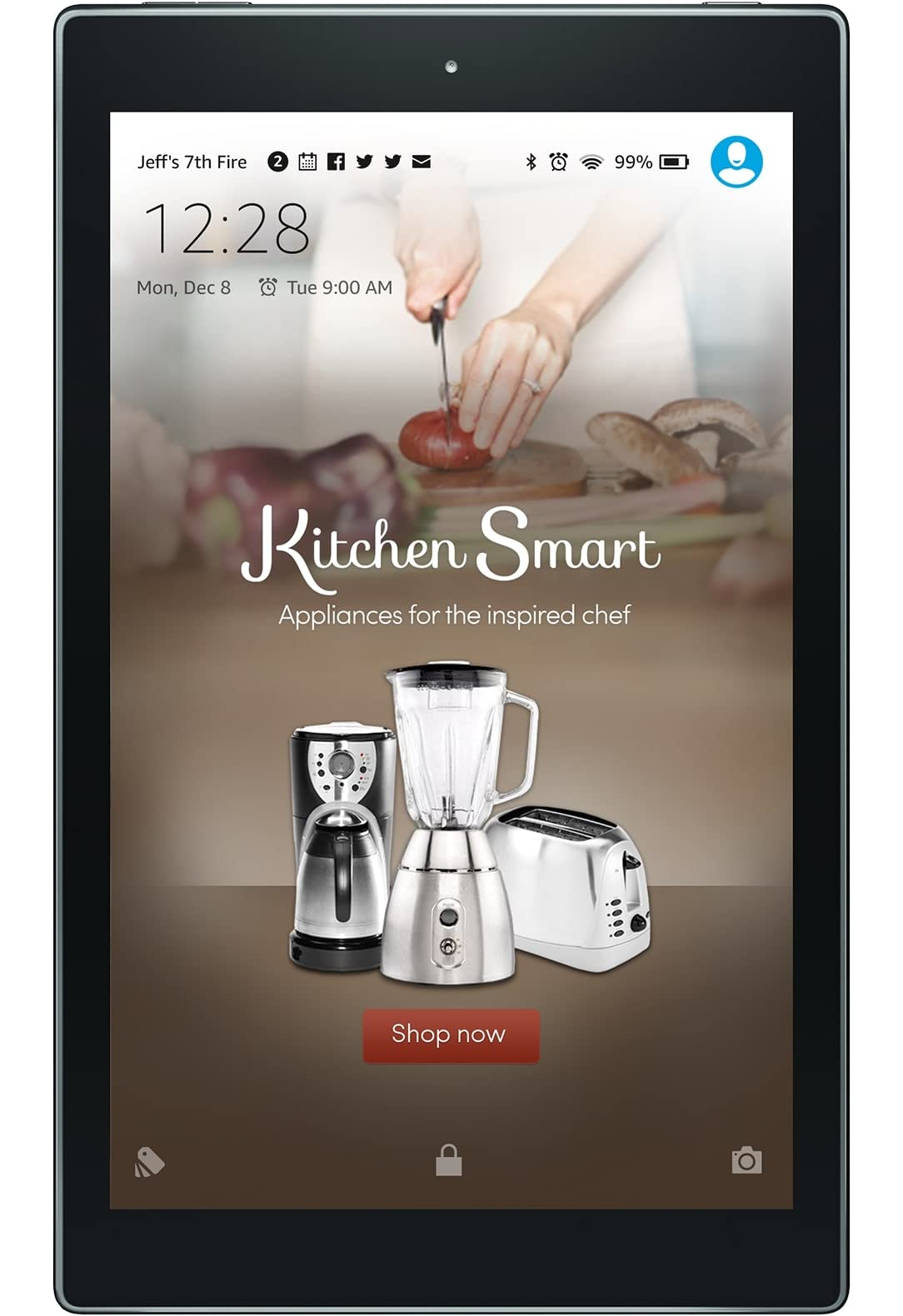
Balanced
- Design elements, product imagery, and text are well proportioned. Visual weight is equally dispersed.
- Messaging hierarchy is clear. Elements are laid out in order of importance (e.g. headline first, subhead second, body text third).
- Overall composition feels integrated. Focal points should dominate without sacrificing unity.
- Elements are justified and/or aligned on the same x- and y-axes. Use of symmetry or asymmetry appears deliberate and purposeful.
Approved ✔

Not Approved ✘
Why?
- Elements are not equally dispersed.
- Elements are not precisely aligned on the same x- and y-axes.
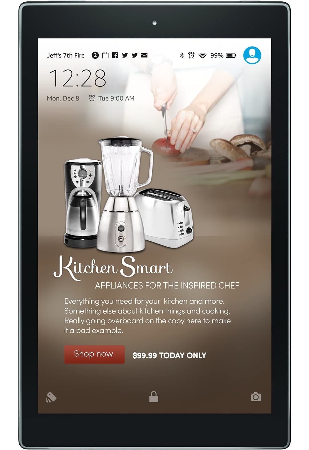
Simple
- Ad copy is kept to a minimum. Unnecessary information or instructions, including “fine print,” are removed. All text is legible.
- Legal symbols can be accepted when part of the advertiser’s logo or included on the product image, but must not be larger than 20pt superscript.
- Two lines of text are allowed as long as they are placed unobtrusively inside of the safe zone and the total word count limit is respected.
- All legal text (e.g. substantiation, copyright statements, and “fine print”) are subject to the maximum total copy limit, treating each character group as a word. (“©2015, Amazon studios®” would be 3 words). If added, text should be a minimum font size of 27pt, and placed unobtrusively at the bottom of the canvas.
- US and EU campaigns only: Total copy (includes legal text) is limited to 35 words, with headlines not exceeding 12 and supporting copy not exceeding 23 words.
- Japan campaigns only: Total copy (includes legal text) is limited to 60 characters, with headlines not exceeding 20 characters and supporting copy not exceeding 40 characters.
- Text is set in a maximum of three typefaces, including the call-to-action button.
- Message bursts and cliché graphic devices are avoided.
- Filters, drop shadows, and other Photoshop effects are used sparingly and subtly.
- If used, animation is restrained, relying on subtlety and finesse.
Approved ✔
Not Approved ✘
Why?
- Text is set in more than three typefaces.
- Supporting copy exceeds 20 words.
Respectful
- The tone of the ad is not “shouty.” Elements that appear overbearing or pushy (such as all-caps copy and exclamation points) are avoided.
- Ad creative does not contain content that is violent, threatening, suggestive, provocative, or inappropriate for a general audience.
- Messaging and calls to action are clear and never misleading.
- Marketing claims are substantiated and in the best interest of the customer.
- Questionable tones of voice (including sarcasm, stereotyping, and competitive slander) are not used.
- Animation is fluid and smooth, not abrupt or forceful. Cuts do not occur quickly or suddenly.
Approved ✔

Not Approved ✘

Why?
- Marketing claim cannot be substantiated.
- Exclamation point and text styling gives the message a shouty tone.
Smart
- Ad copy educates the customer about the main points of the featured product or service.
- Grammar and punctuation are used correctly.
- Images, logos, and text are not pixelated or fuzzy.
- Retouching is photorealistic, avoiding defects in gradients, shadows, and perspective.
- Animation complements the design and supports the message of the ad.
Approved ✔

Not Approved ✘

Why?
- Headline and CTA button are fuzzy.
- Retouching has defects.
Branding, Colors and Typography
- All design elements should match the branding guidelines of the advertiser and not use any Amazon branding elements, buttons, etc., unless expressly approved by Amazon.
- The advertiser’s logo or name must be included in creative execution.
For requirements regarding the use of Amazon.com’s customer star ratings, refer to Customer Ratings below
Ad Content Restrictions
In order to make sure people of all ages have the best experience possible on their Fire, we work with our clients to run ads that are appropriate for all audiences. All Fire ad content must conform to Amazon’s Creative Acceptance guidelines. Amazon requires that advertisers review their content with these guidelines in mind before submitting.
Creative Requirements
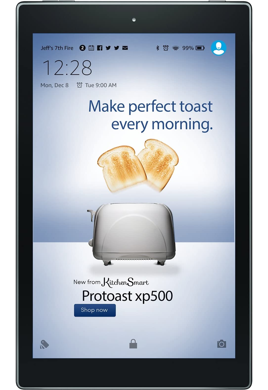
Wake screen
Wake screen creative must conform to the following requirements:
- Content must be appropriate for audiences of all ages.
- All background images must include a full bleed. No white borders or edges.
- Text, logos, and essential product imagery may not be placed behind sliders or buttons.
- The wake screen interface (date/time, battery level, etc.) may be white or black, but must be easily legible.
- Text must be large enough to be legible on all devices.
- Legal symbols within ad copy, such as copyright (©), are discouraged and will be removed by default.
- Legal symbols included in logo lockups or product images are allowed.
- All ads for films, TV shows, or video games should include the appropriate rating icon.
Call-to-Action Buttons
- Call-to-action text must be clear and specific, and should reflect the content of the corresponding landing page.
- Call-to-action buttons or texts are not allowed in the ad background, and must be provided as separate assets.
- No more than two button call-to-actions may be used. To prevent accidental taps, buttons must be spaced at least 20px apart.
- Button call-to-action text is limited to one line of 28 characters (US/EU) or 12 characters (JP). The text should start with a verb and must be formatted in sentence case or to align with the advertiser’s established CTA branding. Mixed case is not allowed.
- Button design should reflect the advertiser’s brand.
- To provide user-friendly tap targets, buttons must have a minimum height of 105px.
Approved ✔

Not Approved ✘

Why?
- Text must be large enough to be legible on all devices (minimum font sizes listed above)
Approved ✔

Not Approved ✘

Why?
- Artwork should not interfere with the legibility of the wake screen interface (date/time, battery level, etc.)
- Call-to-action used on button must be formatted in sentence case or all caps. All lowercase, camel case and mixed case are not allowed.
- Call-to-action is limited to one line of 28 characters (including spaces).
Approved ✔
Not Approved ✘

Why?
- The wake screen interface may be black or white, but must be easily legible.
Customer Ratings
Allowable Placements
Amazon customer star ratings from Amazon.com (or other locale domains, such as Amazon.co.uk or Amazon.de) may be used within ad creative on wake screens and Custom Landing Pages. All use is subject to approval by Amazon.com.
Product Restrictions
- Ratings may only be used on wake screen ads that advertise a single product. Custom Landing Pages, however, may include multiple products and their corresponding ratings.
- Products must have at least a 3.5 star rating and a minimum of 15 customer reviews.
- The rating shown must be for the specific product advertised. For example, if the ad is promoting a 50-inch TV, the rating cannot be from a 55-inch TV, even if it is from the same series.
Creative Requirements
Ratings on the wake screen must use a standard lockup, containing these elements:

- The Amazon customer star rating
- The total number of customer reviews in parentheses
- The date on which the Amazon customer rating was calculated. Formatting of the date should be appropriate to the locale (MM/DD/YY for US, DD/MM/YY for UK, and DD.MM.YY for DE, etc.) This date cannot be more than 3 months old, therefore creative must be updated regularly.
- Font size must be 30pt, for legibility across all device sizes
The standard lockup should be used as is. The only exception is that the font color can be changed when the text needs more contrast with a dark background:
