
Custom Content Row
The custom content row presents an entire row of sponsor tiles, seamlessly integrated into the Fire TV UI. With the Custom Content Row, advertisers can display tailored content and deep links, directing viewers to the content, product, brand, or to download the app. Advertisers can use this ad placement in various ways, such as introducing characters, highlighting catalog offerings, showcasing product collections, tell brand story, delivering a compelling generic message, or capturing viewers with the connected banner design ads. As viewers click through the custom content row, it allows them to explore promoted content, product, brand, and channel offering, enhancing the storytelling and driving engagement and conversion.
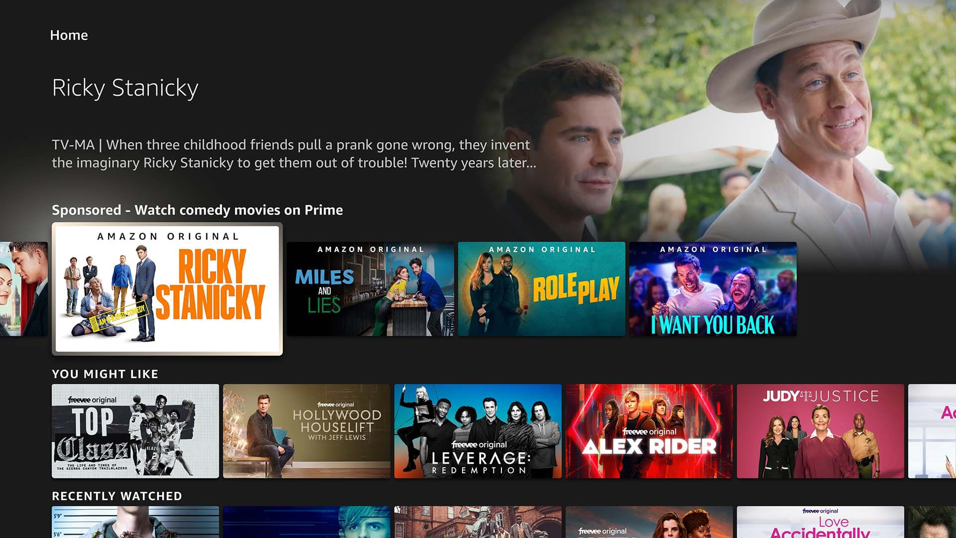
Experience overview
On Fire TV, viewers can scroll down the Custom Content Row using their remote. After navigating to the Home tab, they’ll find a sponsored row titled “Sponsored - [Custom Row Title]” below the fold. When a viewer selects a tile, entitled viewers will immediately begin watching the content. Unentitled viewers will be directed to the app download page, and after installing the app or completing the subscription sign-up process, they can start watching the content directly.
Custom Content Row Scenarios
The Custom Content Row (CCR) supports the following experience scenarios:
1. Storyboard Content Row
This custom content row presents viewers with a full series of images from a single content title or brand. Each tile offers customizable intent URLs for accessing: 1) a brand video landing page, 2) a custom brand landing page, and 3) the ASIN detail page for thorough product exploration. Ideal for significant title releases or brand/collection introductions, this format enhances engagement.
- Utilize mini details to showcase corresponding images on each tile.
- This custom content row requires at least 5 tile images and a maximum of 20 tile images.
Entertainment example:


Non-entertainment example:


2. Connected Banner Style Content Row
This custom content row features a banner-style layout, with a single image stretched across five standard carousel sections. By skillfully overlapping the design of images across adjacent tiles, it creates a captivating visual flow that encourages viewers to engage further and seamlessly navigate through the content. When viewers hover over these tiles, they will see the same mini details across tiles and click to the same destination.
- Only 5 tiles will be allowed for the banner style custom content row.
- Across all five tiles in the banner-style content row will have the same mini details on the content title.
Entertainment example:


Non-entertainment example:


3. Catalog Focus (Multi-Title) Content Row
This custom content row offers viewers the chance to explore a variety of content (including VOD, Live TV, products, and brand) from a single advertiser, or to browse through different seasons of one content title. Upon hovering over the tiles, viewers can access details about each content title, product, or season, along with deep links to the content. Advertisers have the option to utilize this row to promote their services by showcasing multiple VOD titles/Linear, various products, or different seasons from a single title and brand.
- This custom content row requires at least 5 tile images and maximum of 20 tile images.
- Use the mini details to share details that is corresponding to the particular tile.


Asset Specifications
| Image Components | Raw Asset Requirements | Final Asset Requirements |
| Tile image | Dimension: 1280 x 720px or bigger Format: PSD (High-quality and layered), *NO Progressive JPEG | Size: 1280 x 720 Max file weight: 450KB Format: JPG |
| Background image (mini details page) | Dimension: 1280 x 720px or bigger Format: PSD (High-quality and layered) *NO Progressive JPEG | Size: 1280 x 720 Max file weight: 450KB Format: JPG |
| Text Components | Asset Requirements |
| Row title | • Maximum of 100 characters. Must include "Sponsored -" at the beginning of the title, which counts towards the character limit. • In the unselected state, all 100 characters will be displayed on the UI. • The content row title is case sensitive and should be entered exactly as intended, whether in uppercase or lowercase. • Title must not include any percentage-based promotional text, such as discount or savings percentages. |
| Mini-details title | US, CA, UK: maximum of 38 characters JP: Characters will likely be truncated after 20 characters |
| Mini- details description | US, CA, UK: maximum of 130 characters JP: maximum of 75 characters |
Creative Checklist
1. Identify the Correct Creative Guidelines
Use the appropriate creative template based on the type of content row:
| Storyboard Content Row | Connected Banner Style Content Row | Catalog Focus (Multi-Title) Custom Content Row | |
| Stand-Alone Tile Image Guidelines | ✔ | ✔ | |
| Connected Banner Style Creatives Guidelines | ✔ | ||
| Mini-details Component | ✔ | ✔ | ✔ |
*Please refer to the Asset Specification section above for detailed asset requirements.
2. Use the Correct PSD Template
Ensure you are working from the designated PSD template we’ve provided. Advertisers must supply fully editable and layered PSD files to the DCS team. This allows us to design and update the creative in accordance with the Custom Content Row specifications.
Ad Content Restrictions
In order to make sure people of all ages have the best experience possible on their Fire TV, we work with our clients to run ads that are appropriate for all audiences. All Fire TV ad content must conform to Amazon’s Creative Acceptance guidelines and Fire TV Guidelines and Acceptance Policies. Amazon requires that advertisers review their content with these guidelines in mind before submitting.
Stand-Alone Tile Image Guidelines
Follow the Stand-Alone Tile Image Guidelines for tile creatives in CX use cases such as Storyboard Style, Multi-Title Style, and Mixed Ads Content Style.
Guideline 1: Safe Zones
The green overlay area is the safe zone. Essential elements (e.g. head of key character, feature product, title) should be inside the safe zone so it will not be cut off or covered in focused state.

✔ Approved

Why? The focal point of the image and title are inside the safe zone.
✘ Not approved.

Why? Face or key character overlaps with text. Title goes outside of the safe zone.
Guideline 2: Tile Imagery
- For VOD (entertainment) ads: Use imagery contains a prominent element or focal point that effectively promotes the content.
- Content title: The first tile of the feature row should include the content title and entire row should be only displaying relates images to the title.
- Embed logos or text: Avoid using only provider logos in the tile space, as they can be easily mistaken for an app tile, leading to confusion.
- For non-VOD (non-entertainment) ads: Use imagery that communicates a story about the advertised brand, products, services, or promotional events to viewers. Make sure the subject of image matches the ad copy used.
- Brand logo: The first tile of the feature row should include the brand name with an imagery relates to the brand. Avoid using only brand logo in the tile space, as they can be easily mistaken for an app tile.
- Physical products: Imagery should show the advertised product, viewers using the product, or be brand focused.
- Service products: Imagery should show customer using the service or the amenity that’s being advertised, or be brand focused.
- Brand focused: Brand-focused imagery should feature branded characters (e.g. brand mascots, ambassadors, or characters from brand’s commercials), show brand events (e.g. A trail day event from an outdoor product company), or include branded illustrations. Brand-focused imagery must communicate a clear brand story, or a brand’s products or services. Imagery that doesn’t provide context to the ad (e.g. generic patterns and graphics) is not allowed.
- For Mixed entertainment ads: the product tile will only be permitted on the 5th tile. The product must be associated with the entertainment content title.
✔ Approved


Why? The content title is located within the first tile of the content row, making it straightforward for viewers to grasp the promoted content in this row.
✘ Not approved


Why? The content title is not included in the first tile of the row makes it unclear to viewers which content is being promoted; they must rely on the content row title to understand.
✔ Approved


Why? Including image, text copy, or call to action alongside the provider logo within the tile clarifies that it is part of the content row tile, distinguishing it from an app tile for viewers.
✘ Not approved

Why? Having only the logo only within a tile leads to confusion for viewers, who might mistake it for an app tile.
Guideline 3: Ad Copy
Ad copy should be clear, direct, accurate, and understandable to the average viewers. Avoid end punctuation.
- Text only tile: For standalone placements, only one tile with text-only content is permitted—excluding the brand logo tile. This helps preserve the visual-first design of the Custom Content Row, keeping the ad engaging and visually appealing.
- All text within text only tile should be minimum of 24 pt (TV standard font size) and maximum of 96 pt (Arial regular or equivalent size).
- Maximum character allowed within a tile is 36 characters (space included).
- Maximum 3 lines of text allowed within one tile.
- Limit the number of text-only/logo tiles within one content row to a maximum of 2. It is recommended to have only one text-only tile for non-VOD (non-entertainment) to ensure the focus remains on visual content within the row.
- Call to Action: To ensure that viewers can easily understand the promotion, call-to-action text could be 1) in the text only tile as a short phrase, 2) together with a provider logo/ brand logo, 3) together with product-only tile, and 4) the detail text of the mini details as part of the sentence. It may be omitted in only one of these locations, if necessary.
- Do not include additional glyphs (e.g. arrows or underlines), or be embellished as a button.
- Do not add a separate call to action if it is implied already as a part of other text (e.g. Use “Available to rent on Amazon Video” rather than “Available to rent on Amazon Video. Watch now.)
- For VOD (entertainment) ads, use a recommended CTA whenever possible.
- Promotional message: When including a promotional offer (e.g., "Save $5", "$0.99 per month", "10% off") in viewer communications, ensure the following:
- Placement: The promotional message must be included only in the 5th tile slot of the custom content row.
- Promotion Source: Clearly identify who is driving the promotion.
- Promotion Details: Clearly state what the promotion applies to.
- Terms and Conditions: Clearly indicate that there are restrictions or rules to the promotion and provide information on where viewers can learn more (e.g., "Terms apply. Learn more here").
✔ Approved


Why? With just one text-only tile in the promotional content row, the overall design maintains a sense of balance.
✘ Not approved


Why? The design loses cohesion and very text heavy when there are more than two text-only tiles within the row.
✔ Approved

Why? The promotional message is placed in the 5th tile slot of the custom content row, identifying the source and details, and indicating terms and conditions.
✘ Not approved

Why? The promotional message is NOT placed in the 5th tile slot of the custom content row; the promotion is unclear and without indicating terms and conditions.
Guideline 4: Avoid Tile Border
Border designs will not be permitted as they disrupt the overall Fire TV UI, particularly during tile-focused states, and can create an overwhelming visual experience for viewers. For seamless user experience, the native appearance must be maintained.
✔ Approved


✘ Not approved


Guideline 5: Accessibility
- Image should be accessible across all devices. Avoid logos or title that doesn't meet font size and minimum contrast ratio required.
- Images and text must have a minimum contrast ratio of 4.5:1. Larger text (24px/18pt font or larger) can have a contrast ratio of 3:1. A minimum font size of 24px for the living room Fire TV experience is recommended.
✔ Approved

Why? The logo is clear, easy to read, and pass the contrast ratio.
✘ Not approved

Why? The logo is unclear and difficult to read. The font color and background did not meet the contrast ratio
Guideline 6: High Definition
Image should be scalable across all device sizes, avoid using blurry or unclear visuals.
✔ Approved

Why? The image is high-definition and clear.
✘ Not approved

Why? The image is blurry and unclear.
Guideline 7: Avoid Large, Empty Spaces for Stand Alone Tiles
Maximize the safe zone by prominently featuring the key elements. Ensure the composition maintains balance.
✔ Approved

Why? The title and image are inside the safe zone and fills the tile.
✘ Not approved

Why? There is a lot of empty space between the image and tile because the aspect ratio is different, or the tile has been cropped; image should fill the tile.
✔ Approved

Why? The balanced composition of the key character and background makes it easy for viewers to see the tile's content.
✘ Not approved

Why? The background image overwhelms the tile, and the key character's face is difficult to see. The overall composition of this tile makes it difficult to determine what's being displayed.
Connected Banner Style Creative Guidelines
Follow the Connected Banner Style Creatives Guidelines when designing for the Connected Banner Style CCR to ensure visual consistency and engagement. If selecting a different CX use case, you must follow the Stand-Alone Tile Creative Guidelines instead.
Guideline 1: Safe Zones
Keep the essential elements (e.g. face of key character, title, ad copy, and/ or product) of the images within the green safe area. Essential elements should not be outside of the safe zone to prevent being covered or cut off in different states of UI.

✔ Approved

Why? Key characters’ faces, content title, providers logo, and the call-to-action copy are within the safe zone.
✘ Not approved

Why? Content title goes outside of the safe zone.
Guideline 2: Composition and Clarity
- Ensure that the promotion is easily understandable from the banner's content alone, requiring only a quick glance.
- Use compelling imagery to engage viewers.
- The placement of the elements should not appear scattered within the composition - create a focal point.
- Keep the word count to a minimum (typography limits)
- Maximum banner copy limit is 20 words. Word count limits apply to ad copy, call-to-action, and disclaimer text (if includes in the creative) within the 5 tiles banner. This does not apply to text within logos.
- All text within text only tile should be minimum of 24 pt (TV standard font size) and maximum of 96 pt (Arial regular or equivalent size). Recommended font size is 28pt.
- Legal font size 14pt.
- Maximum 3 lines of text allowed within one tile.
- The banner must appear as a continuous unit.
- Must use connecting images and present as a hero image as the entire row.
- Blend foreground elements with the background content of the ad, creating a cinematic stripe:
- The main object must be clearly visible. The main object, including the character's face or key subjects, must be visible within the tile and blended into the composition using shading, blurring, masking, and additional imagery.
- Tile, ad copy, and channel logos should be readable and within a tile, if it is necessary to break into two connecting tiles, it should be divided by word. A single word cannot be broken into two separate tiles.
- Closely cropped imagery can look out of scale on large screens. Avoid displaying human features, such as the eyes, at extreme scale.
- Ensure that the focal point (e.g. key subjects or character heads) of a background image is inside the green safe zone.
✔ Approved


Why? The key main objects (e.g. key subjects or character heads) are inside a tile and within the safe zone.
✘ Not approved


Why? The main objects (e.g. key subjects or character heads) are divided between two tiles, making it difficult to see.
✔ Approved


Why? The content titles (brand logo), main objects (e.g. key subjects or character heads), ad copy, and the provider's logo are seamlessly integrated without being fragmented or separated by tiles. All elements are easily visible.
✘ Not approved


Why? The word in the ad copy is split into two tiles, making the ad copy difficult for viewers to read.
✔ Approved

Why? This creative includes interconnected images arranged in an overarching banner.
✘ Not approved

Why? The image in the third and fourth tiles are noticeably inconsistent with the others, resulting in a disconnected appearance for the banner.

Why? The first and fifth tile has inconsistent design making the entire banner appear as an incontiguous unit.
Guideline 3: Avoid Large, Empty Spaces for Connected Banner Style
Fill the safe zone with the key subject to the background image as much as possible. Avoid having a completely empty tile (with no key subject) within the consecutive tiles. Blank tiles may cause confusion as viewers browse through the content row and are inconsistent with the information provided on the mini detail page. The creative should focus on maintaining visual consistency and eliminating unnecessary empty spaces to enhance the viewer experience.
✔ Approved

Why? All the elements are inside the safe area, filling every tile in the content row and is aware of visual balance.
✘ Not approved


Why? The graphic content and design elements in this creative did not make use of all five tile spaces. Banner-style executions should avoid leaving tiles empty or using background-only visuals, as this breaks the continuity of the full-banner experience.
Mini-details Components
When the ad is selected, additional information about the content is revealed in the “mini details” area that occupies the top third of the screen.
| Asset | Requirements |
| Background image (mini details page) | Size: 1280 x 720 Max file weight: 450KB Format: JPG |
| Mini-details title | US, CA, UK, JP: maximum of 38 characters JP: Characters will likely be truncated after 20 characters |
| Mini- details description | US,CA,UK: maximum of 130 characters JP: maximum of 75 characters |
Background Image
The background image supplements the visuals that are included within the custom content row.
Guideline 1: Safe Zone

The green overlay area is the safe zone. Essential elements (e.g. head of key characters, title) should be inside the safe zone so they don’t get covered. The blue overlay area is the legal/ disclaimer safe zone.
✔ Approved


Why? The focal point (face of key character) is on the right side and in the safe area.
✘ Not approved


Why? The focal point of the image (face of key character) is outside the safe zone and would overlap with the title text.
Guideline 2: No Text on Image
- No text or app logos on the background image.
- Keep the imagery simple and feature human subjects whenever possible.
- Avoid including numerous subjects or fine details.
- Avoid cropping heads and faces by following the guides included in the template, which denote where content will be cropped and masked.
✔ Approved

Why? The title text will be clear and noticeable because there isn’t text on the image.
✘ Not approved

Why? The title text won’t be clear because it could overlap with the text on the image.
Guideline 3: High Definition
Image should be scalable across all device sizes. Avoid using blurry or unclear images.
✔ Approved

Why? The image is high definition and clear.
✘ Not approved

Why? The image is low-resolution and blurry.
Guideline 4: Legal/Disclaimer Text
- Where beneficial to the viewers, up to two lines of legal text may be accepted.
- Claims and substantiation: follow guidance for Claims and Substantiation.
- Any use of unnecessary text, including legal “fine print”, copyright statements, legal symbols or Terms & Conditions is discouraged. Our recommendation is to provide full terms & conditions or disclaimer copy on the landing page. If added, text should be white or black, less than 60% opacity, set in 14pt Arial regular (or equivalent font), and placed unobtrusively in the bottom right corner of the mini detail background image, inside of the blue safe zone shown above.
Guideline 5: Auto Play Video (Optional)
Video Requirements
Video Duration: 10.0 to 60.0 seconds
Video Codec: h264, mpeg4, mpeg2video, h265, hevc
Video Bitrate: Min = 2000 kbps
Video Resolution: Min Height = 1080 px, Min Width = 1920 px
Video Aspect Ratio: 16:9
Video Stream Count: 1
Video Chroma Subsampling: FALSE
Audio Codec: aac, pcm, mp3
Audio Bitrate: Min = 128 kbps
Audio Stream Count: 1
Audio Channels Range: Min = 2 File Size: Max = 500 MB
File Container Format: AVI, DV, MOV, MP4, MPEG, M4V
*Video must meet all requirements. No edits will be made to the original assets.
When a customer hovers over a tile, text and image detail content is revealed in the top half of the screen. After one second, a video can replace the mini-details static background image and begin to play with audio enabled. After the video concludes, the mini-details static background image is shown again.
The video content should be short (10 – 60 seconds), engaging, and inspire the customer to click through to additional content. Treat the video as a fast overview of the advertised product. Use compelling imagery and motion to show an overview of the content.
- It is preferable to not show letterboxing in videos (black bars above and below). However, if the content being promoted uses letterboxing in the full-length video, then the trailer may feature letterboxing as well.
- Watermarks or Logos: It is preferable to not include watermarks/logo overlays within the video as this can draw focus from the primary video content. However, these overlays are allowed, provided the following guidelines are met:
- The logo is placed within the safe zone.
- The logo does not cover up key content (such as an actor’s face) or other text within the video.
- Disclaimers, legal text, captions, copyright notices, or other small type detract from the primary video content when used as continuous overlays. Limited amounts of text may be shown, interspersed as focal onscreen content during portions of the video, e.g. when the name of a director or studio is briefly shown during a trailer.
- Logos and text within the video must be legible and not cut off. Text (including legal/disclaimer text) must be a minimum 64px font size when viewed at the full 1920x1080 video size. This ensures legibility when the video is scaled down in the mini- details portion of the UI.
- Avoid repeating the same video across all tiles within the CCR. For banner-style CCRs, include the video only in the first tile’s mini-details and use static images for the remaining tiles.
Recommended Custom Content Row (CCR) Experience with Video:
- Storyboard CCR: Advertisers are encouraged to attach unique videos to each tile’s mini- details, enabling richer storytelling by presenting varied perspectives across tiles while maintaining consistency with the overall campaign narrative.
Entertainment example:

First tile focused, mini-details displays content’s trailer video

All remaining tiles show unique video of the content in their mini-details section.

All remaining tiles show unique video of the content in their mini-details section.
Non-entertainment example:

First tile focused, mini-details displays brand/product’s trailer video

All remaining tiles show unique video of the product in their mini-details section.

All remaining tiles show unique video of the product in their mini-details section.
- Connected banner CCR: Advertisers can feature a video in the mini-details of the first tile to create a strong initial impact, while using static images for the remaining tiles. Video only should only be included in the first tile’s mini-details and avoid repeating the same video across all tiles.
Entertainment example:

First tile focused, mini-details displays content’s trailer video

All remaining tiles show the same static image in their mini-details section.

All remaining tiles show the same static image in their mini-details section.
Non-entertainment example:

First tile focused, mini-details displays brand/product’s video

All remaining tiles show the same static image in their mini-details section

All remaining tiles show the same static image in their mini-details section
- Catalog focus (multi-title) CCR: Advertisers are encouraged to include trailer videos for each content title within the content row to enhance discovery and drive viewer engagement.

When each tile focused, the mini-details displays the corresponding trailer
When each tile focused, the mini-details displays the corresponding trailer

When each tile focused, the mini-details displays the corresponding trailer
Guideline 6: QR code (Optional)
For non-M&E CCR, a QR code may be added to drive engagement and provide an interactive call-to-action, connecting customers to their second-screen devices where they can learn more or make a purchase from the product or brand.
QR code placement overview

| QR Code Requirements | |
| QR code dimension | Suggested size of 200 x 200 px |
| QR code CTA | Use text string “Scan to shop on Amazon” or “Scan to learn more” |
Safe zone

The green area is the safe zone for the background image of mini details. Keep essential elements (e.g. the head of a key character) inside the safe zone so they don’t get covered by the dark overlay and QR code component.
The purple area represents the safe zone for the QR code component. Please ensure to place the QR code component only within the area to avoid covering essential elements or placing it too close to the edge.
QR code component placement location
- Custom Content Row: Embed the QR code component in the bottom right corner of the mini details background image, ensuring a 48px margin from the right edge and a 145px margin from the bottom edge to prevent it from being covered by the inline display banner.


Mini-details Text Requirements
- All-cap copy may be use in mini details title but may never be used to write the entire mini-details description.
- Exclamation marks may not be used unless they are embedded in a logotype or are part of the proper name of a piece of content.
Content Rating Labels (VOD (entertainment) content only)
A content rating is required for entertainment content. Advertisers must choose a rating that aligns with the target audience. Sports content and news channels are exempt from this requirement.

Locales
- CA
- US
- UK
- JP
Related Policies
Supported Destinations
Dependent on Row Styling (Connected Banner, Character Focus, or Catalog), advertiser can specify click-through destination per tile.
- Product detail pages
- Prime Video Channels pages
- Integrated landing pages
- Deep links
- Advanced: Custom Intent